That is the window of opportunity you get when a commuter walks past a utility pole in SOMA, waits for the light to change on Market Street, or ducks into a coffee shop in Oakland. In those three seconds, your poster is competing with high-definition smartphone screens, the noise of a passing MUNI bus, and the general mental "blur" of a busy Bay Area day.
If your design doesn't hit like a lightning bolt, it’s just expensive wallpaper.
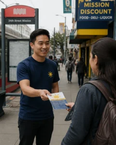
At Thumbtack Bugle, we’ve been the boots on the ground for physical poster and flyer distribution since 1976. We’ve seen which designs get "8 new students from one campaign" and which ones get ignored. Designing for the street is a different science than designing for a digital feed.
Here are the five visual secrets to creating posters that don't just exist, they command attention.
1. The "Eight-Foot Rule": If They Can't Read It, They Won't Lead It
The most common mistake we see is a poster that looks like a legal document. Small fonts, long paragraphs, and complex descriptions are the fastest way to lose a potential lead.
The "Eight-Foot Rule" is simple: your primary headline must be legible from at least eight feet away. Why? Because most commuters are in motion. They aren’t walking up to your poster to study it like a museum piece; they are glancing at it from the sidewalk or across the street.
The Science of Typography
Sans-Serif is King: For street-level marketing, sans-serif fonts (like Arial, Helvetica, or Futura) are far superior. They convey urgency and clarity. Save the fancy cursive for the wedding invitations.
Weight Matters: Use "Heavy" or "Bold" versions of your font. Thin lines tend to disappear against the visual noise of a city street.
The Size Guide: If you want someone to read your title from 12 feet away, that text needs to be at least 60 points. For a standard 11×17 poster, your headline should occupy the top 20% of the page.
Ideally, your headline should be no more than five to seven words. "FREE JAZZ IN THE PARK" beats "Come Join Us for an Evening of Local Musical Talent and Community Engagement" every single time.
2. The Power of High Contrast (The Navy and Yellow Secret)
Have you ever wondered why safety signs use yellow and black? It’s because those color combinations provide the highest level of visual contrast to the human eye.
In the Bay Area, where the background is often grey concrete, red brick, or the white glare of a fog-covered sky, your colors need to pop. We’ve found that a deep navy blue background with vibrant yellow text (the core of the Thumbtack Bugle palette) is a powerhouse combination. It feels professional, authoritative, and, most importantly, it is impossible to ignore.
Choosing Your Palette
Limit Your Colors: Stick to two or three colors max. A rainbow of colors creates "visual vibration," which is physically painful for the eye to process quickly.
Avoid Pastel: Light greens, pale blues, and soft pinks wash out under the California sun or the fluorescent lights of a BART station. Go for saturated, "true" hues.
Dark Background, Light Text: While black on white is a classic, white (or yellow) on a dark background often feels more modern and "pops" more effectively in an outdoor environment.
But the reality is, even the best colors won't save a cluttered design. That leads us to the next secret.
3. The "Local Wink": Connect with the Bay Area
Generic ads get generic results. If you want to stop a San Franciscan or an Oaklander in their tracks, you need to show them that you are of the neighborhood. We call this the "Local Wink."
When you use local references or landmarks, you instantly build "street cred." It signals to the commuter that this isn't a national corporate blast, it's something happening right here, right now.
How to use Local Context
Neighborhood Specifics: If you are distributing in the Mission, mention the 24th Street corridor. If you're in Oakland, a "Port of Oakland" reference or a nod to the Lake Merritt area builds immediate rapport.
Commuter Lingo: Use terms like "The 38 Geary," "The Caltrain Shuffle," or "East Bay Vibes."
Visual Landmarks: A subtle silhouette of the Sutro Tower or the cranes of the Port of Oakland can act as a visual anchor that grounds your brand in the local culture.
By positioning yourself as a local neighbor rather than a distant advertiser, you bypass the "sales" filter that most people have active when they are out in public.
4. Master the 40/40/20 Rule
One of the hardest things for business owners to do is leave empty space on a poster. You’re paying for the printing and the distribution, so you want to use every square inch, right?
Wrong.
A crowded poster is a dead poster. To ensure your message is digestible, we recommend the 40/40/20 Rule:
40% Graphics/Images: One large, high-quality focal point.
40% White (Negative) Space: Empty areas that allow the eye to rest and focus on what matters.
20% Text: The essential details (Who, What, Where, When).
The negative space acts as a frame for your content. It guides the eye toward your call to action. If you cram the edges with logos, social media handles, and testimonials, you’re just creating a puzzle that nobody has the time to solve.
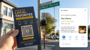
5. The Strategic CTA: Avoiding the QR Code Trap
The next thing you’ll need to do is get them to take action. In 2026, the QR code is the gold standard for bridging the physical and digital worlds. However, most people use them incorrectly.
A QR code is not a design element; it is a destination.
QR Code Best Practices
Size Matters: A QR code on a poster should be at least 2 inches by 2 inches. Anything smaller is difficult for a smartphone camera to pick up from a standing distance.
Placement: Never put a QR code at the very bottom of a poster. If the poster is placed on a utility pole or a low window, the commuter has to crouch down to scan it. That’s a friction point that will kill your conversion rate. Keep it at chest level.
The Incentive: Don't just put a code there. Give them a reason to scan. "Scan for 20% Off" or "Get the Full Lineup Here" provides the necessary nudge.
Putting it All Together
Designing a poster for the Bay Area is about balancing art with high-velocity communication. You aren't just making something pretty; you're building a tool to drive traffic, sell tickets, or grow your community.
Does your current design follow these rules?
Can it be read from eight feet away?
Does the contrast jump off the wall?
Is it anchored in local Bay Area culture?
Is there enough room for the design to breathe?
Is the call to action effortless?
If the answer to any of those is "no," it might be time for a redesign before your next campaign.
Let the Experts Handle the Heavy Lifting
At Thumbtack Bugle, we do more than just hang posters. We understand the rhythm of the city. We know which bulletin boards in Berkeley get the most eyes and which storefronts in San Francisco have the highest foot traffic. We can even help you with campaign planning, copywriting, and design to ensure your "three seconds" count.
Stop throwing money at Meta's confusing algorithms and start owning the streets where your customers actually live and work.
Ready to launch your next local campaign? Let’s get your brand in front of real people. Contact Thumbtack Bugle today.


")
")