Posters can be an effective way to communicate important messages and promote events or products. However, creating content for a poster can be challenging, as you need to convey your message in a clear, concise, and visually appealing way.
In this blog post, we will provide tips for creating crisp and engaging poster content that will grab the attention of your target audience in the Bay Area and effectively communicate your message.
Before you start creating your poster, identify your target audience and consider their interests and preferences. This will help you to tailor your message and design to resonate with them. Here are some tips on understanding your audience:
Define your target audience – Identify the specific demographic or group of people you want to reach with your poster. This could include factors such as age, gender, interests, or location.
Conduct research – Conduct research on your target audience to gain a better understanding of their interests, preferences, and behaviors. This could include online surveys, focus groups, or analyzing existing data.
Consider their needs – Think about the needs and interests of your target audience when creating your poster content. What problems are they facing? What solutions can your message provide?
Use language and tone that resonates – Use language and tone that resonates with your target audience. For example, if you are targeting a younger audience, you may want to use more casual language and humor, while a professional audience may prefer a more formal tone.
Think about the context – Consider where your poster will be displayed and the context in which it will be viewed. This can help you tailor your message and design to the specific environment.
By knowing your audience, you can create poster content that effectively communicates your message and resonates with your target audience. This will increase the likelihood of achieving your desired outcome and engaging your audience when they’re going about their business in San Francisco.
Keep your poster content simple
Your poster should convey your message in a clear and concise way. Avoid cluttering your poster with too much text or images, as this can make it difficult to read and understand.
Focus on a single message. Identify the most important message you want to convey on your poster and focus on that. Avoid trying to communicate too many ideas at once, as this can make your poster appear cluttered and confusing.
Use simple and straightforward language to convey your message. Avoid using technical jargon or complex words that may be difficult for your audience to understand. Also, prioritize information on your poster based on its importance. Use hierarchy to make important information stand out and ensure that it is easy to find.
Use bullet points and short paragraphs to break up text and make it easier to read. This will also help to ensure that your message is clear and concise. Finally, avoid cluttering your poster with too much text, images, or design elements. Keep your design clean and uncluttered to make it easier to read and understand.
Use visuals
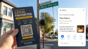
Add visual elements, for example, images or graphics, to make your poster more engaging and visually appealing. After all, you need to standout from other posters on display in the Bay Area. Use high-quality images that are relevant to your message and use them to complement your text.
You can also incorporate graphics and illustrations to visually enhance your message and make it easier to understand. This is especially useful when trying to convey complex information or data.
But don’t forget to leverage white space to create a clean and uncluttered design. This will help to make your visuals stand out and make it easier for your audience to read and understand your message.
Captions and labels can provide context for your visuals and help your audience understand their meaning. Plus, make sure you use visuals that incorporate your branding, such as your logo or brand colors. This will help to reinforce your brand and create a cohesive design.
By effectively using visuals in your poster, you can create a more engaging and visually appealing design that effectively communicates your message to your target audience.
Choose the right colors
Use colors that are eye-catching and grab attention, but also reflect your brand or message. Use contrasting colors for text and background to ensure readability. Here are some tips for selecting the right colors:
Understand color psychology – Different colors can evoke different emotions and feelings in people. For example, red is associated with excitement and passion, while blue is associated with calmness and trust. Consider the emotions and feelings you want to convey in your poster and select colors that align with those goals.
Use a limited color palette – Using too many colors can make your poster appear cluttered and confusing. Instead, use a limited color palette of 2-3 colors to create a cohesive design.
Use contrast – Use the contrast between light and dark colors to create visual interest and make your poster easier to read. For example, use a dark font on a light background or a light font on a dark background.
Consider accessibility – Consider the accessibility of your color choices for individuals with color vision deficiencies. Use high-contrast colors and avoid using color alone to convey important information.
Incorporate your branding – Incorporate your brand colors into your poster design to reinforce your branding and create a cohesive look.
Use typography wisely
Choose fonts that are easy to read and appropriate for your message. Use different font sizes and styles to create a hierarchy and draw attention to important information.
Choose the right font
Choose a font that is easy to read and reflects the tone and message of your poster. Avoid using decorative or complex fonts that may be difficult to read.
Use hierarchy
Utilize hierarchy to prioritize information and make it easy to scan. Use larger font sizes for headlines and important information and smaller font sizes for supporting information.
Avoid using too many fonts
Using too many fonts can make your poster appear cluttered and confusing. Stick to 2-3 fonts to create a cohesive design.
Use contrast
Use contrast between font sizes, colors, and styles to create visual interest and make your poster easier to read. For example, use bold fonts for headlines and regular fonts for body text.
Use white space
Use white space to create a clean and uncluttered design. This will help to make your typography stand out and make it easier for your audience to read and understand your message.
Incorporate a call to action
Include a clear call to action on your poster, such as visiting a website or attending an event. This will encourage people to take action and engage with your message.
Make your call to action clear and concise, so your audience knows exactly what you want them to do.
Use actionable language that encourages your audience to take action, such as “register now” or “visit our website.”
Provide a reason for your audience to take action, such as a discount or a special offer.
Use a sense of urgency so your audience feels encouraged to take action immediately, such as “limited time offer” or “act now.”
Make your call to action visible by placing it in a prominent location on your poster and using contrasting colors or bold fonts.
Get feedback
Before finalizing your poster, get feedback from others to ensure that it effectively communicates your message and is visually appealing. This can help you to identify any areas for improvement and make necessary changes.
Order posters that stand out in the Bay Area
Here at Thumbtack Bugle, we lead the way when it comes to poster design and poster distribution across San Francisco.
From San Jose to Sonoma, we serve all areas, including San Francisco, Oakland, Berkeley, and Silicon Valley, with distribution available outside of the Bay Area.
We handle distributions that range from 100 to 10000 pieces. If you’re looking to get the word out to the Bay Area, we can help. Place your order today to get started.